Painting J078: 'Fewer Not Less' |
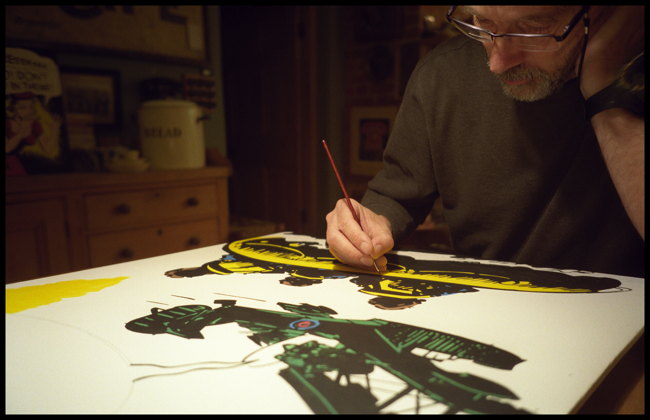 Painting 'Martin and the Walrus' (J090) in November 2018. You can see my concentration. |
| I've 'painted' since 1994. The canvases are always of bold punchy images, usually comic panels, dishwasher labels, aeroplane safety cards, things like that, meticulously copied and occasionally changed in some way, usually the wording in the speech bubble. I'm not a figurative painter, in fact, I don't think I'm a painter at all - perhaps a copyist, creating brightly-painted panels to fill an empty hole on the wall, the same way I write books to fill an empty time in space. I think what I also try and do is attach relevance to who they are intended for, as for the most part, when you buy a picture or a poster or a print then you have to establish the relationship with the image yourself - for me, I want to establish the relationship before you receive it by making the image somehow unique and relative to the the person it is intended for. Sort of like a bespoke painting, but you don't know what it will be, and in my quirky fashion, I will find a link to you with the picture. The following was a painting intended for a friend of mine who was not keen on lazy grammatical usage, so the following sequence of photographs give you an idea of how I made this up over about a week in January 2016. |
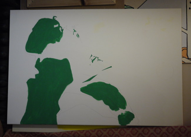 Not much to look at here yet, but the panel is made from MDF as it's a good flat medium to work, and dead cheap. I usually place battens on the back for stiffness, but inboard of the edge so it will hang slightly proud of the wall, generating its own drop shadow. This measures 27" X 18", and here I am just blocking in the dark green - colours usually first, then black finelining. |
 The blacking in starts as soon as the colour is blocked in. This panel is from Sword of Oshima , a War Picture Library publication from 1966. The pose is a familiar one in battle action comics, which probably accounts for just how well it has been drawn - not all images were as good, especially when you consider that most illustrators were under severe time constraints they went from rough pencil to india ink with little in between. I was greatly taken with the dynamic quality of the image, and also of the way the clothes drape on the figure, and the weight of his sidearm pulling down on his webbing belt. Renaissance painters were particularly keen on the folds of clothes having 'weight'. The names of the illustrators were usually never credited. I don't know who originally drew this. |
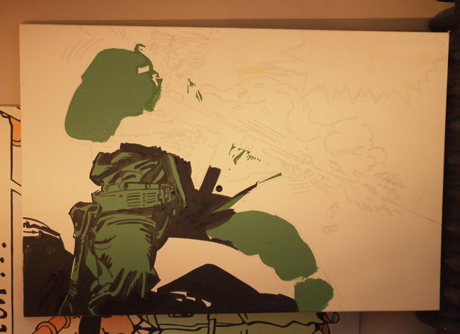
 The original image was in Black and White, but I wanted to colourise it, so after carefully marking out the image on the MDF with a 6H pencil I printed out several copies of the image to figure out what colour went where. Because I am hugely fond of the 'Ben Day Dot' method of transparent ink overprinting, a technique used frequently in comics of the 60s and 70's, whereby a grid of fine dots overprinted on another colour (or by itself) can give a limited yet impressive array of tones. You can also make secondary colours by overprinting blocks of colour. The green here would be emulating the overprinting of yellow and blue. |
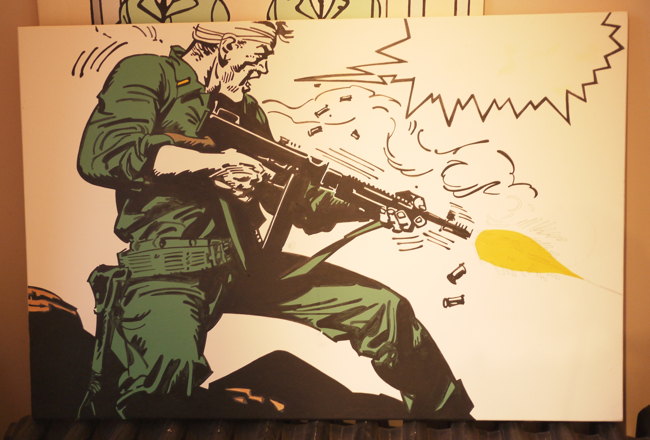 The image is coming together now. The panel was shortened on the Y axis to fit an existing picture frame used for something else - if I don't like a painting I will reuse the canvas, either reversing it or overpainting. Here I've added the brown on the rocks (emulating overprinting of cyan, magenta and yellow) and the muzzle flash. The black needs going over quite a bit to get it deep and dark. Muralists often say you should never use black but a very dark blue, but I've never agreed with this. The paint is acrylic. |
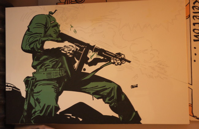
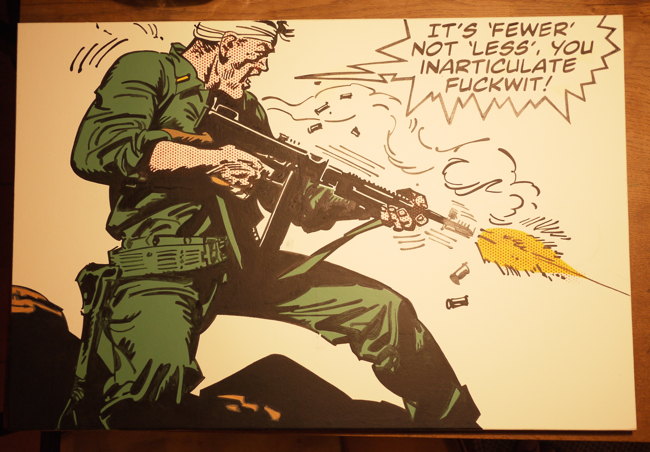 The original speech bubble read: 'This is for you, Hoshimoto, YOU DIRTY LITTLE TURNCOAT!' - relating to the demise of a perceived traitor within the platoon. Bubble was enlarged to take new dialogue, based on an original dinner conversation with Alex. He, like I, have a mock-hatred of improper English. My original idea was to have 'It's 'fewer' not 'less' you inarticulate motherf**ker' which sounds better to the ear but was a little too fruity, even for me, who swears a lot. 'Fuckwit' is a half-way house I could live with. The font is 'Mild Mannered', one I have adopted for all speech bubbles, as I like the uniformity between the paintings. You can see here I have overlaid the dots to give an impression of fleshtone. Slight cheating in that I used red paint rather than magenta; the usual way would be magenta dots over yellow dots. I usually take a picture after each work session, then a final picture under daylight to get the colours reproduced properly. |
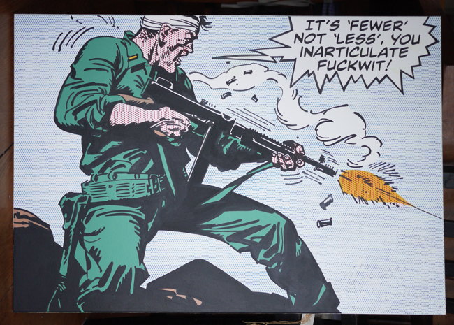 After staring at it for a bit I opted to go with a blue Ben Day dot sky. The dots are laser cut in an A6 size stencil, and just stippled through - it takes a long time, and care has to be taken to ensure that the stencil is in alignment when I move it around as the stencil is too small to cover all the sky in one go. It made sense for the smoke to be left white. This was my 78th painting - I gazetteer them all quite carefully. They either end up in my house which is colourfully adorned with all this crap, or I lend - not give - them to friends. I think I've sold one for a charity event; you can see it in 'Great Elevator Waiting Moments' somewhere else in Jasperland. I haven't seen Alex for a while, so don't know if it's still on his wall. To be honest, it doesn't matter - I just like doing them. |